Canada’s National Arts Centre Redevelopment
Shining like a beacon and with a refreshing immediacy to its sound, Canada’s National Arts Centre (NAC) has emerged from a comprehensive four-year renovation of its edifice and production infrastructure.
Split into two phases— architectural rejuvenation and production renewal— for financial and scheduling reasons, the project was completed within the $225.4 million budget allocated by the Government of Canada, which was apportioned almost equally between the two phases. Architectural rejuvenation of the Ottawa, Ontario building, was completed in time for the commencement of Canada’s 150th anniversary celebration on July 1, 2017, while the renovation of production facilities and infrastructure was postponed until the summer of 2018, when the Centre was shut down for three months to facilitate work within its four performance venues.
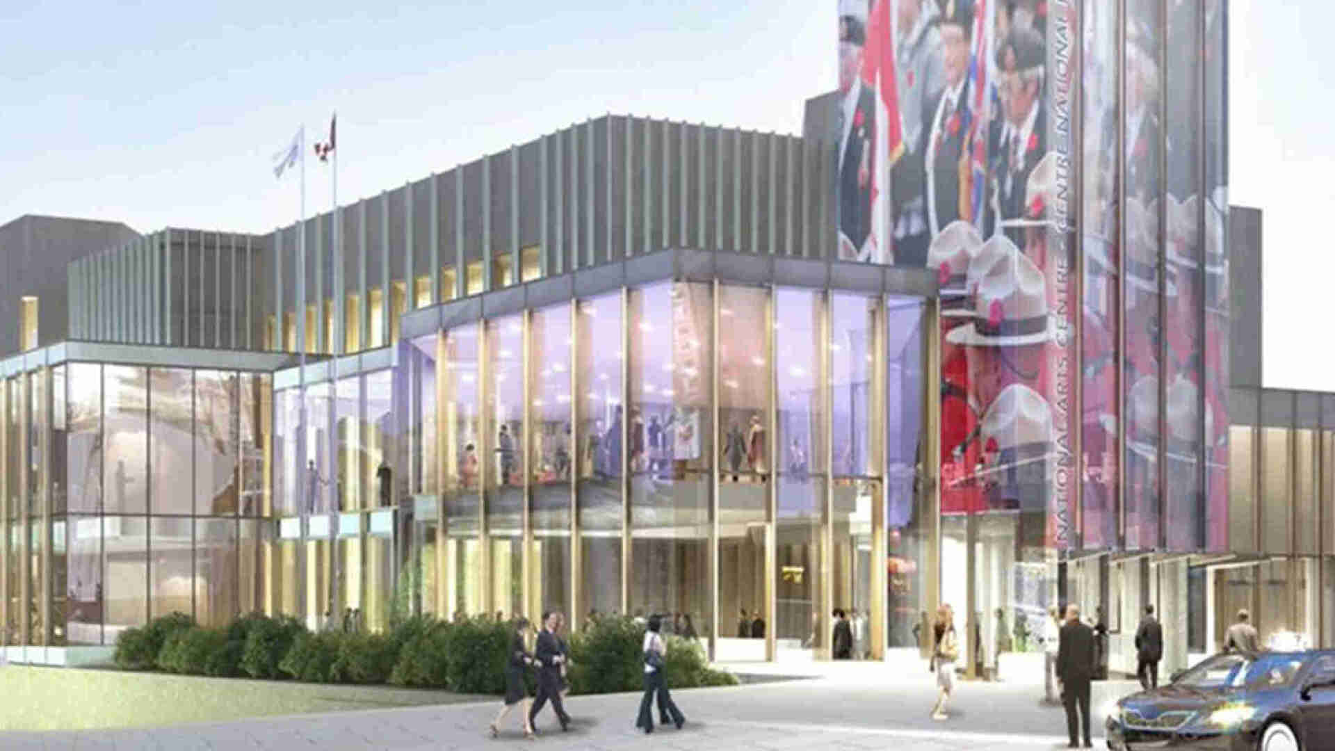
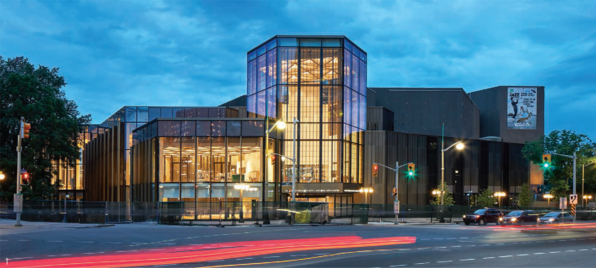
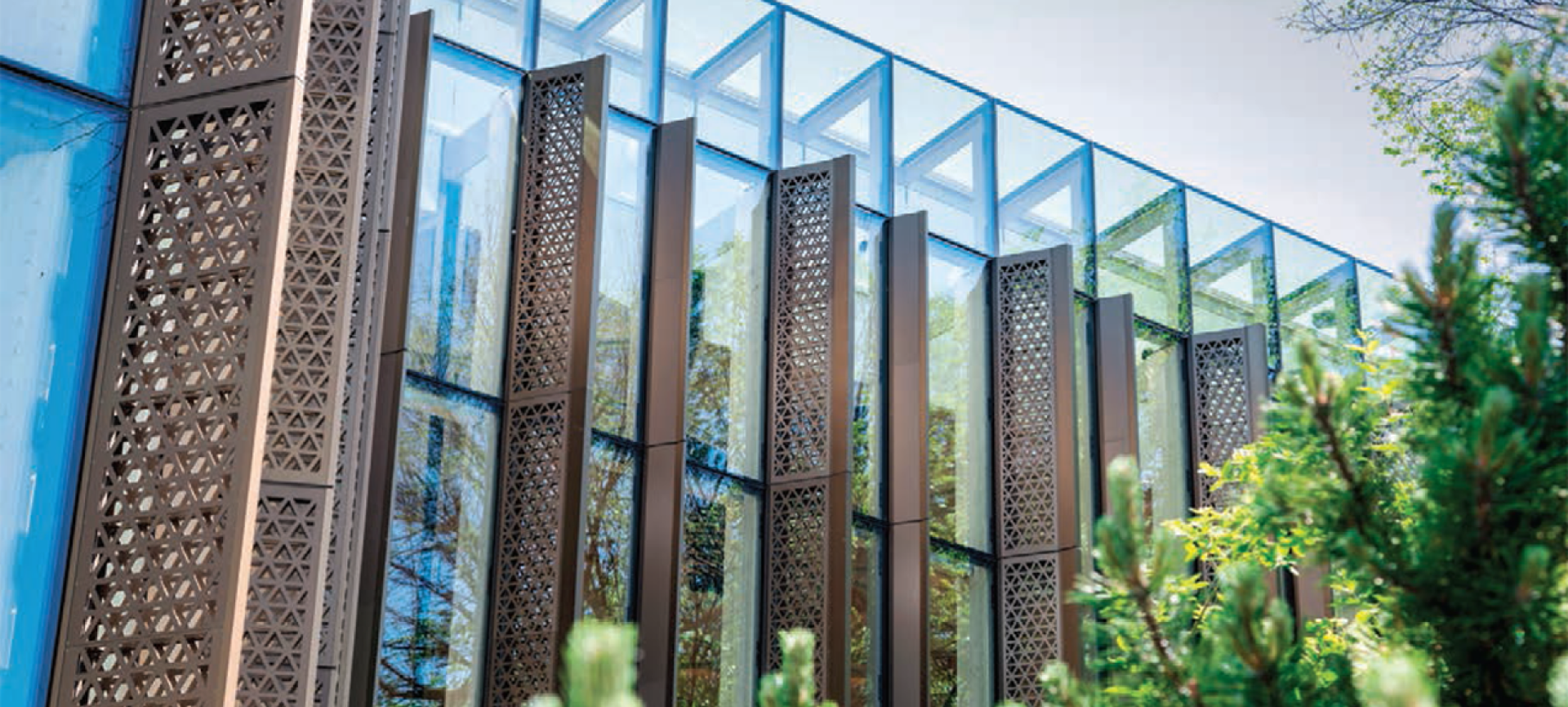
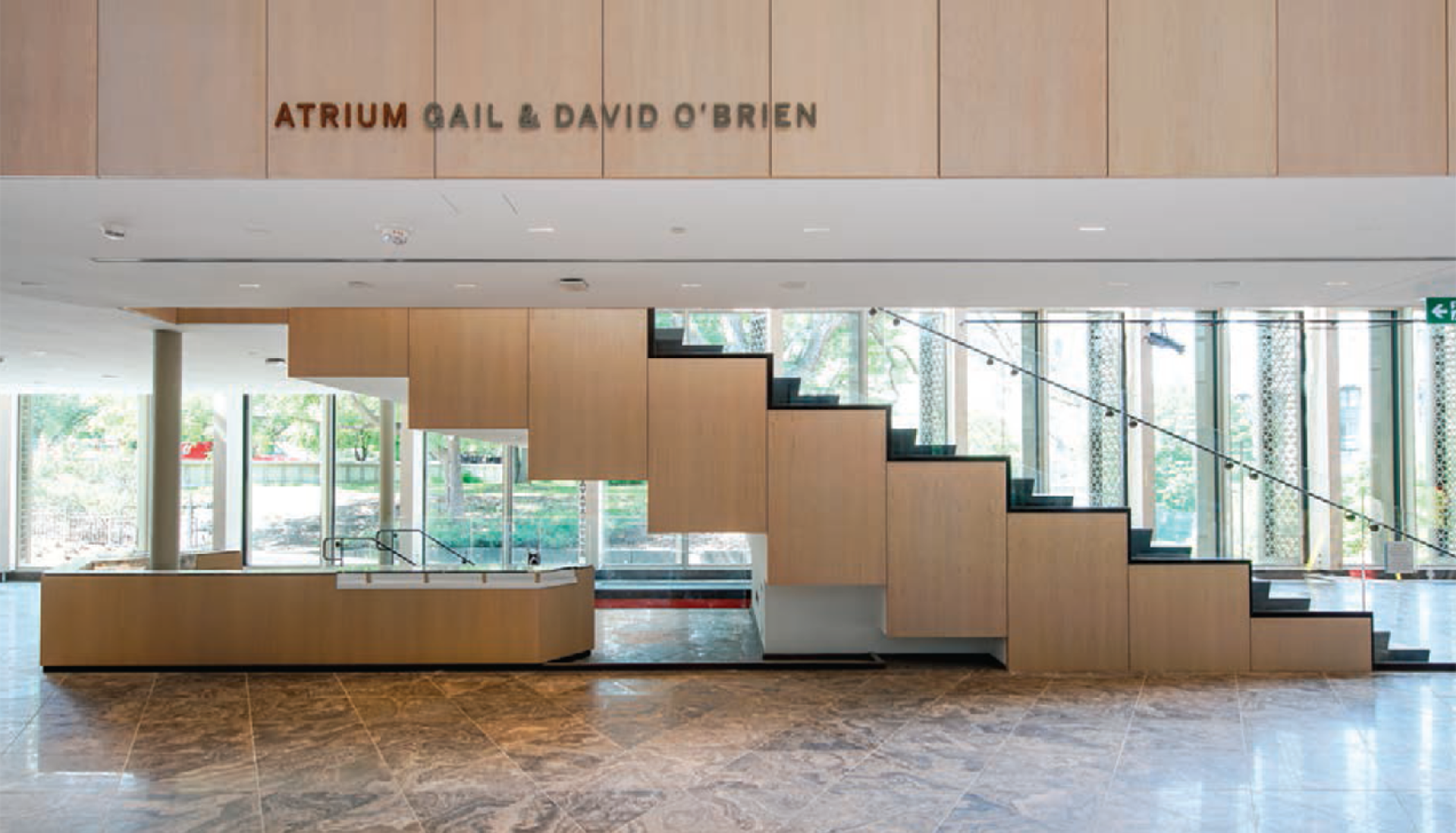
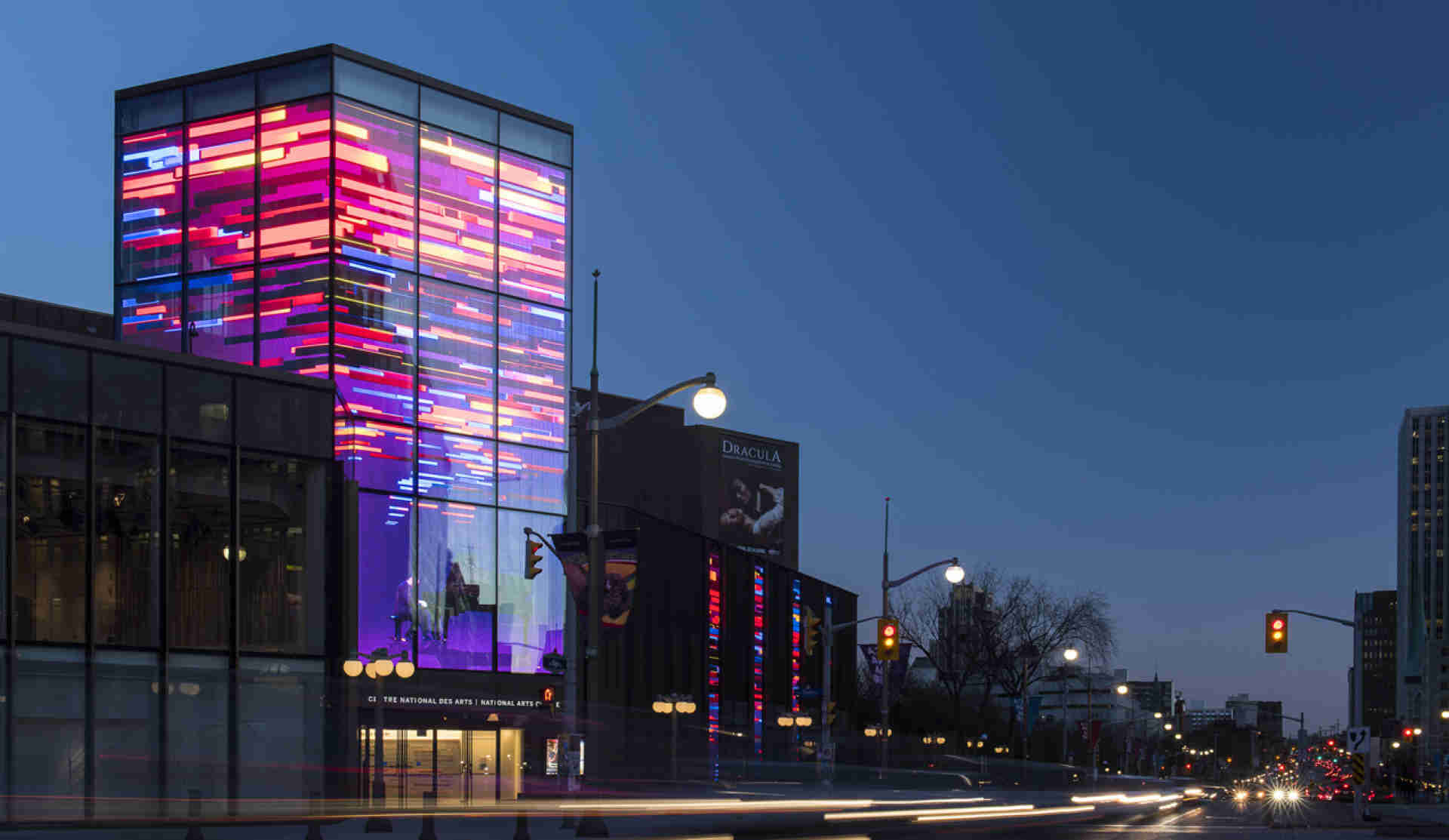
During the overhaul of the 50 year-old performing arts center, an outdoor terrace that saw little use in winter was enclosed within a new glass envelope and developed into four new interior spaces and an atrium. A new front door was set into the base of a three-storey transparent video “lantern” on the major downtown thoroughfare Elgin Street, a simple stroke of genius that effectively turned the building around to face and welcome the city.
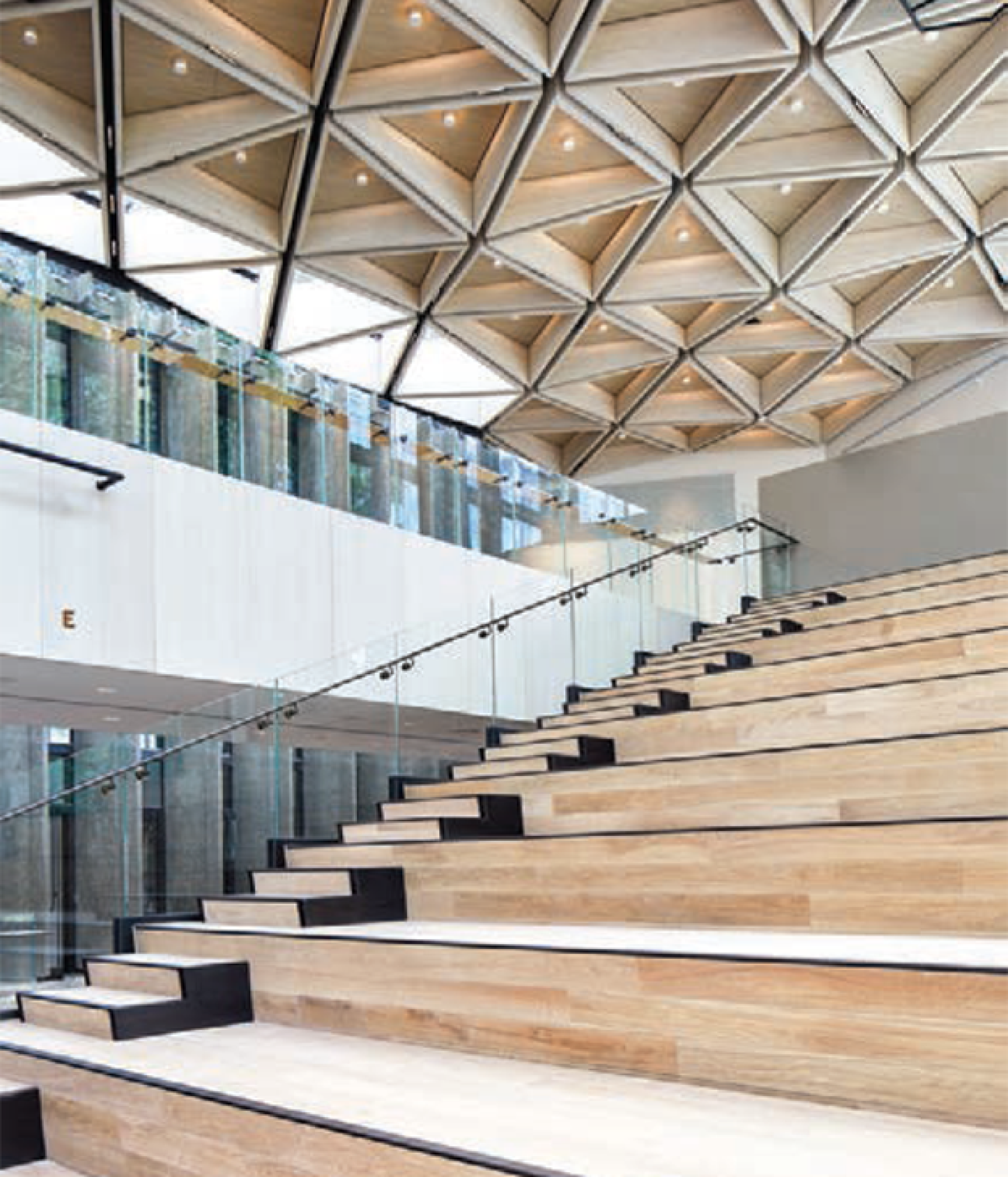
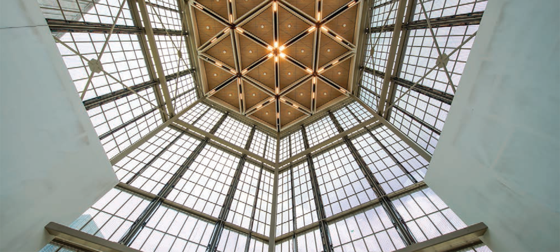
Under the guidance of project architect Jennifer Mallard, principal at Toronto-based Diamond+Schmitt Architects, the overall effect of Donald Schmitt’s design is nothing short of the complete transmutation of a dark, hulking concrete bunker into a lighter and brighter structure offering views of Canada’s Parliament Buildings and other nearby landmarks that were not even possible in the original Brutalist design, but that now feature prominently from fully glazed public spaces beneath gorgeous wood coffered ceilings.
“The new NAC honours the change in the way people experience the arts now. In the new public spaces, you can look in and see the creative activity from the street level. It is inviting you in. People who are walking by will feel welcome to go in and enjoy.”
CARL MARTIN
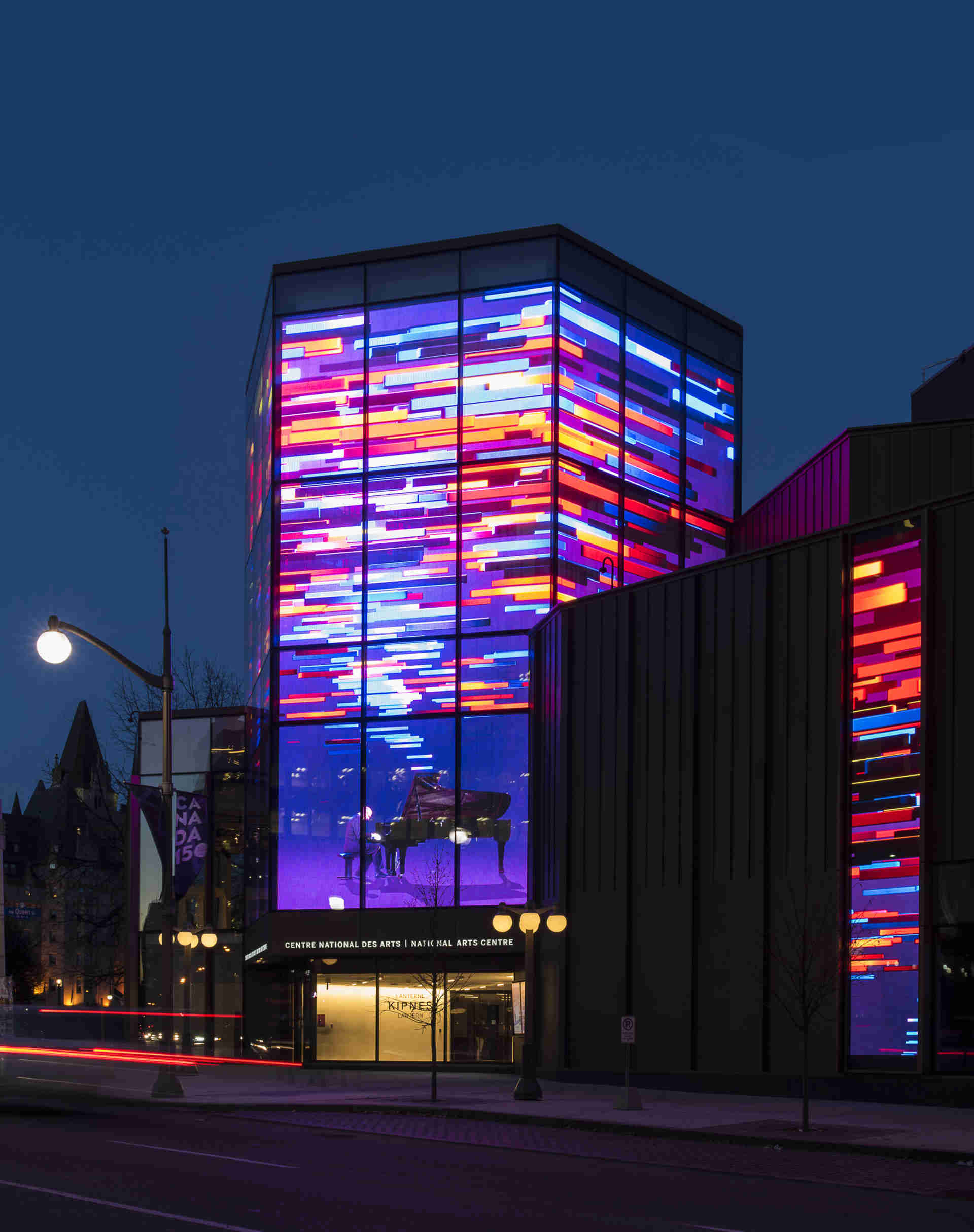
Bridging the original building and the addition is the Kipnes Lantern, a three-storey glazed hexagon with the Centre’s front door in its base on the ground floor, and the 1,300-sq.-ft. high-ceilinged Lantern Room occupying its upper two-thirds. The Lantern, constructed over what was originally a single-storey hexagonal entrance to the parking garage from the then-rear of the building, features the largest transparent media façade in North America.
An array of LED screens mounted inside the glazing on the four of its six sides facing the city is capable of livestreaming performances from inside the Centre or from anywhere else in Canada, in addition to providing digital signage. Indeed, on any day of the week, performances in venues across the country are heralded on the hexagonal tower’s transparent video walls, reflecting the NAC’s motto, “We are Canada’s stage,” as if the Lantern were Canada’s premier marquee.
Fabricated as 428 transparent modular LED panels in 13 customized panel types by Vancouver-based ClearLED, the 50′-high, 16-mm-pitch LED displays cover 3,440-sq.-ft. at 8,000 nits (about 25,000 lux) with up to 93 per cent transparency—not a single screw is visible. “It is emergent technology that has been used for retail and traveling rock shows. This is a different interpretation of that technology, and a vehicle to link the arts across the country in more of a national communication,” Mallard says.
Martin Van Dijk, senior consultant and partner with consultants Engineering Harmonics and the primary audio-visual designer for the entire project, is an enthusiastic advocate of this technology. “The types of video walls typically used in large concert tours present too much visibility-reducing structure for this application,” he says. “We came up with the see-through idea first, and then developed that into a design, and found a company to fabricate it to our specifications. We didn’t want to have a typical video wall.”
The transparent media façade is linked to four two-storey-high video displays spaced farther along the sidewalk on the Elgin Street side of the building, such that images can be moved across the front of the building to and from the Lantern. Because they are viewable at closer range, each of these 150 sq.-ft. displays features a tighter 6-mm LED pitch.
“The other really cool thing is that you can see through the Lantern into the building, especially at night,” Van Dijk says. “One of the driving questions behind the design was, How do we make the Centre more open to the public? It has always been closed off; this used to be the rear entrance to the building. So while we were striving to be open and inviting, we didn’t want to create a barrier with a giant video wall; hence the transparent façade. You can see into the building and simultaneously have a video image. It’s really spectacular sometimes, such as when they take the production lighting and animate the interior. You can do tricks, too: one night they had a rotating cube on the display. From outside, it looked like the cube was just floating in space, because you didn’t see the video wall on account of the interior lighting,” he says.
“Peter Herrndorf, the Centre’s former president and CEO, believed that as the largest performing arts center in the country and the only federally owned one, the National Arts Centre should be more inclusive of the entire country, and he envisioned this as a beacon for the performing arts in Canada. Because Canada does not have a huge population, this what our country needs; and not just a beacon to provide information, but perhaps more importantly, a new form of canvas for the arts community. The Lantern has the potential to become a digital canvas that allows the NAC to collaborate with other arts organizations to create digital media artworks for curation and presentation here. With that in mind, the back end became a big concern, particularly selecting the type of server farm and database, because once you start doing that, the amount of data that must be managed is enormous,” Van Dijk says.
“The new National Arts Centre honors the change in the way people experience the arts now. You can look into the new public spaces and see the creative activity from the street. It is inviting you in. People who are walking by will feel welcome to go in and enjoy,” he adds.
Given its shape and extensive glazing, Van Dijk initially questioned how well the Lantern Room might function in its secondary role as a meeting room with a capacity of 72-120, sitting or standing. “It’s a coffee can. I thought it was going to be an absolute nightmare from an acoustics point of view, but Threshold Acoustics has done a great job—you can hear the results. This room has got some life, but it’s not the terrible echo chamber that it should be given its geometry,” he says, noting that absorptive acoustic panels and angular diffusors line two of the lower walls. “Visually, that gives a texture to the room—plus it sounds great.”
The authors of the NAC’s five-year strategic plan for 2015-2020 suggested that the renovation “has the potential to transform everything we do. Like the refreshed Lincoln Center in New York, or the revamped Southbank Centre in London, U.K., the re-imagined NAC will fundamentally change our relationship with the public, inviting people from all walks of life to enjoy its attractive and transparent public spaces, and allowing us to engage with our patrons in a more meaningful and contemporary way.”
That is what the architects, consultants, engineers and contractors set as their goal. As Jennifer Mallard says, “We wanted to provide increased connection with the National Arts Centre across the country, improve public accessibility and improve the ‘street to seat’ experience for patrons.” In the process, they have wrought perhaps the most luminous and welcoming facility for artists and audiences in the country.
